Class: Human Computer Interaction, CS 5332
Name: Bao Dien Quoc Nguyen
R#: R11660127
ID# : 12
Presentation page.
GitHub repository.
OneDrive link.
Source link.
The figure below is interface of elevator in the building of Department of Industrial, Manufacturing & Systems Engineering. Its users may come from many different cultures and languages.

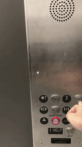
This interface has several excellent points as well as some inconveniences for users, especially for international students. However, I only focus on its bad design.

One disadvantage is that the distance between buttons and their signs is too large. Moreover, the color of these buttons is quite similar to the color of the elevator. Those things may affect the interaction of users and the elevator, for black signs are more obvious over the background. Someones might press a number to choose the desired floor instead of the beside button.
Another thing which we need to concern is positions of the button. In this case, we must read from left to right. Any students who are familiar with right to left languages might have some troubles with this design.
Finally, some letters below the buttons are not necessary, for we do not need two explanations for one button. The signs are internationally used, so even non-English speakers can understand them much more than these phrases.
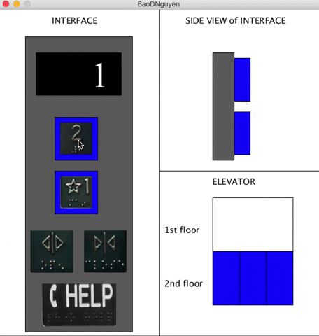
Here is my design for the interface

Firstly, I put the signs into the buttons with a light around each. If the button is pressed, the blue light will turn to red to clarify that the elevator knows where it should go. The color will turn to green when it comes to the floor which was required. This might help to improve the interactions between users and the elevator.

Secondly, the order of buttons is now vertical instead of horizontal one, for I believe it meets the common sense of most users.
Thirdly, I combine Alarm and Help into one button, called Help. These buttons are utilized in emergency, and they play different role. This sometimes makes users confuse which button they should press, especially when they are not calm enough. Therefore, I believe an integrated button is better for emergency.
Fourthly, I give up the Stop because some individuals can use it for their criminal activities. This button might be move to another area instead of the user one in case authority need to use it.

Finally, I use Braille letter for blind people. They can also touch the button to know if they arrive the floor they want or not because the side size of the button can be change after being pressed and at the arrival.
Click here to get the zip file of application.