The Battery Card is a custom Home Assistant card designed to display battery levels with various layouts and styles. It offers flexible configuration options, including different layouts, styles, and image customization based on battery levels.
If you are interested in supporting me, my channel, or my creative work,
any support is greatly appreciated:


- Display battery levels with customizable images
- Multiple layout options to fit your dashboard design
- Style configuration for card, name, state, and image
- Simple integration with Home Assistant
Install the repository as a custom repository in HACS:
- Open HACS.
- Click on the three dots in the top right corner.
- Select "Custom repositories".
- In the opened window, enter the repository URL:
https://github.com/MaxxKra/battery-card.git. - Choose "Lovelace" for the category.
- Click "Add".
After adding:
- Close the window and search for the repository in HACS.
- Select it and click "Install" at the bottom right.
The repository and its resources will be automatically added. You may need to clear the browser cache and refresh the browser.
- Download the
battery-card.jsfile. - Place the file in your
wwwfolder. - Add the following to your
ui-lovelace.yaml:
resources:
  - url: /local/battery-card.js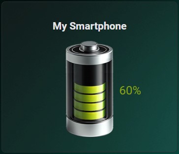
type: moduletype: 'custom:battery-card'
entity: sensor.battery_sensor
name: 'Battery Sensor'
layout: default| Option | Type | Required | Default | Description |
|---|---|---|---|---|
entity |
string | Yes | The entity ID of the battery sensor | |
name |
string | No | Custom name to display | |
layout |
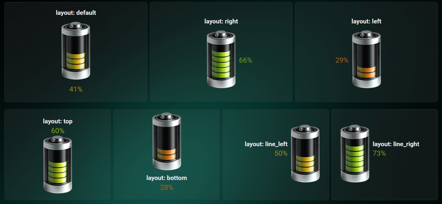
string | No | default | Layout of the card (options: default, bottom, left, right, top, line_left, line_right) |
styles |
object | No | Custom styles for different elements | |
rowGap |
string | No | '0' | Gap between rows |
columnGap |
string | No | '0' | Gap between columns |
The styles object can have the following properties:
| Style | Type | Description |
|---|---|---|
name |
array | Custom CSS styles for the name |
state |
array | Custom CSS styles for the state |
card |
array | Custom CSS styles for the card |
image |
array | Custom CSS styles for the image |
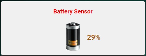
type: 'custom:battery-card'
entity: sensor.battery_sensor
name: 'Battery Sensor'
layout: right
rowGap: '10px'
columnGap: '10px'
styles:
  name:
    - color: red
    - font-size: 20px
  state:
    - font-weight: bold
  card:
    - background-color: '#f0f0f0'
  image:
- size: '50%'The card supports multiple layout configurations:
| Layout | Description |
|---|---|
default |
Default layout with the name at the top, image in the middle, and status at the bottom |
bottom |
Image at the top, name in the middle, status at the bottom |
left |
Image in the middle left, name at the top, status on the left |
right |
Image in the middle right, name at the top, status on the right |
top |
Name at the top, status in the middle, image at the bottom |
line_left |
Image on the right, name and status on the left |
line_right |
Image on the left, name and status on the right |
For advanced users, the card can be further customized using CSS styles for individual elements.
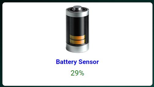
type: 'custom:battery-card'
entity: sensor.battery_sensor
name: 'Battery Sensor'
layout: bottom
rowGap: '5px'
columnGap: '5px'
styles:
  name:
    - color: blue
    - text-align: center
  state:
    - color: green
    - font-size: 24px
  card:
    - background: '#ffffff'
    - border-radius: '10px'
  image:
    - size: '80%'
- margin: '0 auto'This project is licensed under the MIT License.
Feel free to open issues or submit pull requests to improve the card. Your contributions are welcome!